Role
Duration
Team
Overview
The City of Longmont, Colorado, needed a website overhaul to address outdated navigation, inconsistent content, and accessibility challenges. The old site struggled to serve residents, businesses, and visitors effectively.
The redesign focused on creating a user-friendly and accessible platform aligned with the city's goals: enhancing operational efficiency, fostering community engagement, and delivering better services to all.
Why do we think there's a need for a redesign?
Residents, businesses, visitors, and city staff of Longmont struggle to find and use important information and services on the current city website due to complex navigation, inconsistent content, and accessibility issues.
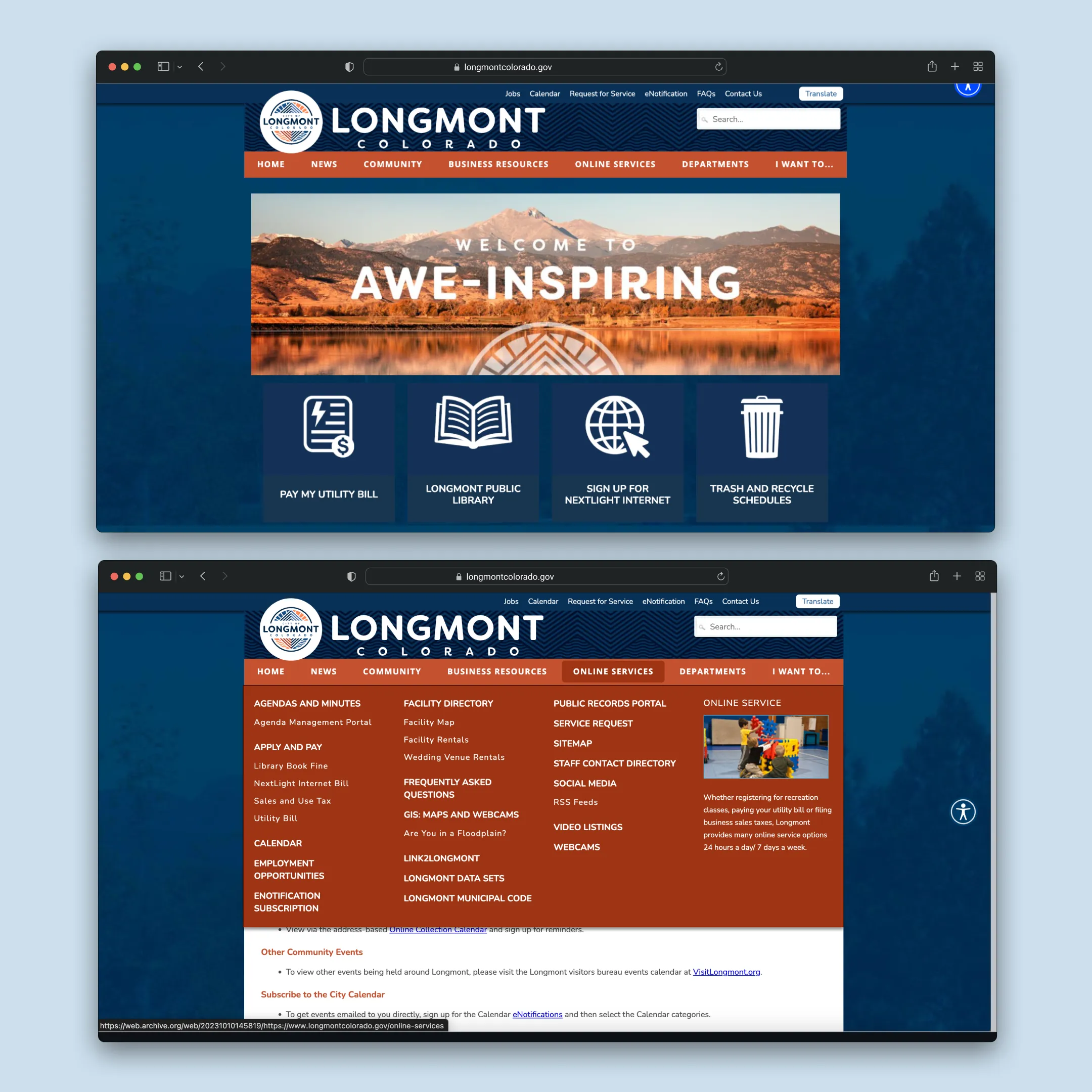
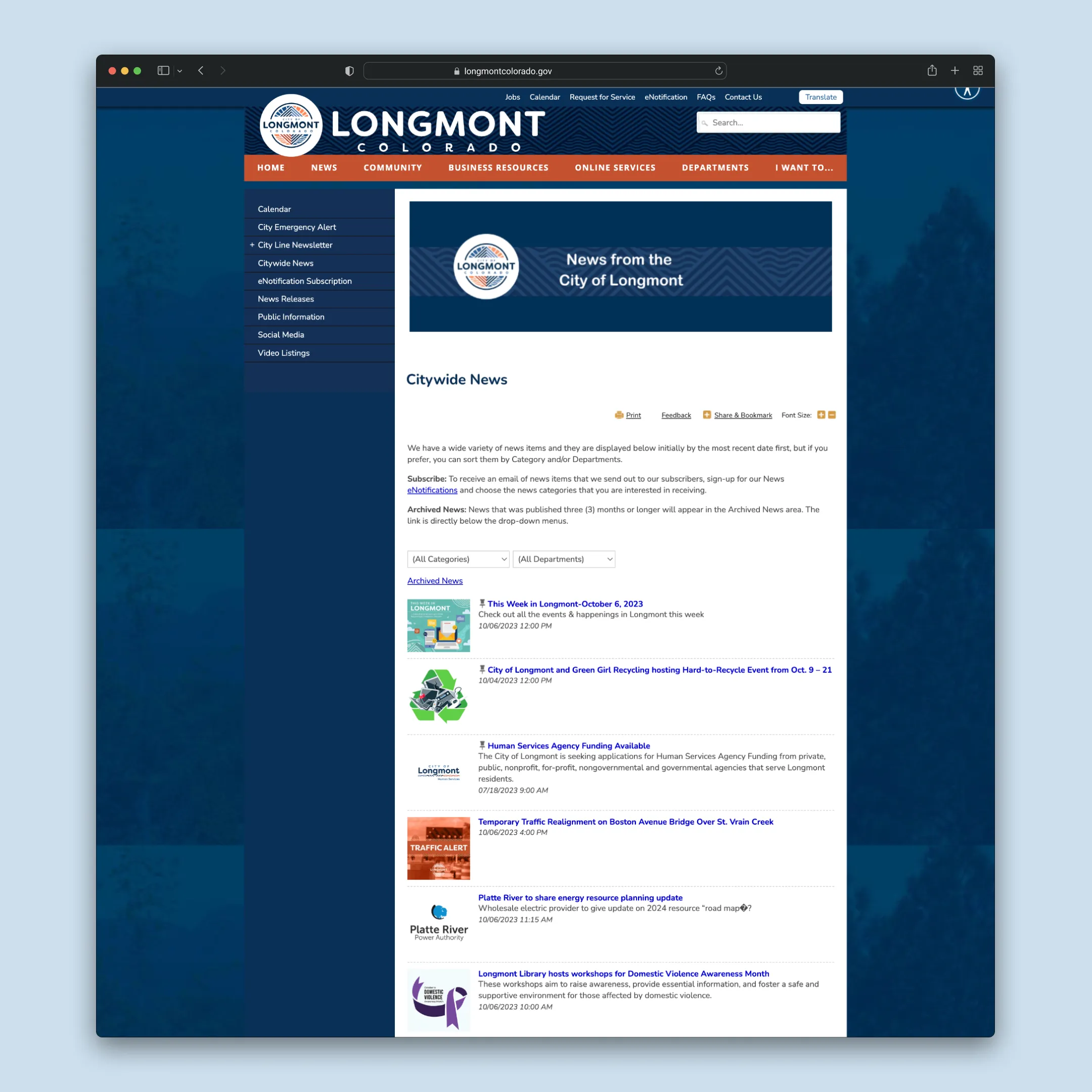
Old Website
Problem Statement
How might we create a more intuitive, accessible, and user-friendly platform that meets the diverse needs of all stakeholders, ensuring efficient service delivery and enhancing community engagement?
Discovery and Research
Our discovery phase for the City of Longmont website redesign focused on understanding user needs, pain points, and behaviors through various research methods, including stakeholder interviews, usability testing, and data analysis.
What different research methodologies unveiled
Stakeholder Interviews: Identified goals (e.g., accessible city services) and challenges (navigation issues, CMS inefficiencies, inconsistent content).
Usability Testing of the Live Website:
57.1% struggled with navigation.
23.8% reported content inconsistencies.
14.3% raised ADA compliance concerns; mobile-first design was flagged as essential.
Google Analytics: High homepage traffic but 40% lower retention on mobile compared to desktop, highlighting mobile optimization needs.
Hotjar Analysis: Users struggled with poor content visibility, confusing categories, and unclear clickable elements.
Competitor Analysis: Found municipal best practices: clear navigation, card layouts, and mobile-first designs improve discoverability and usability.
Key Insights
Improving Navigation
Clear, intuitive navigation with well-labeled pathways is essential to reducing user frustration.
Responsiveness is key
A cross-platform compatible design approach is critical to enhance user retention and ensure seamless accessibility acr oss devices.
Content Organization:
Better content categorization and structure, supported by intuitive design, improves overall discoverability and user experience.
These findings informed the new design strategy, leading to a user-centric, accessible, and mobile-optimized platform for Longmont’s diverse community.
Objectives and Goals
To carry the project forward, we defined four key goals:
Improve User Experience
Create an intuitive, engaging interface with simplified navigation, reducing the time and effort needed to find information.
Streamline Information Architecture
Organize content logically to make navigation seamless, categories clear, and search functionality effective.
Enhance Accessibility
Ensure ADA compliance with features like screen reader compatibility, keyboard navigation, and high-contrast designs for inclusivity.
Align with the City’s Digital Strategy
Support transparency, community engagement, and efficient service delivery while integrating analytics and feedback tools.
These goals guided the project toward delivering a user-centered, accessible, and efficient platform.
Ideation and Concept Development
Creative Concepts
During the redesign process, we explored two creative directions

Concept A
A vibrant, modern design that blended Longmont’s welcoming community spirit with efficient service delivery. It preserved the city’s heritage while enhancing usability through intuitive layouts and bold colors.
Concept B
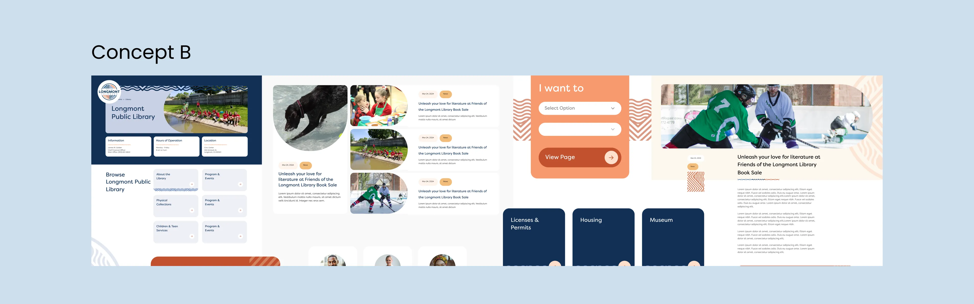
A clean, accessible design focused on simplicity and inclusivity. It featured a modern, approachable interface with softer tones, fostering a friendly and engaging experience.
The final design combined Concept A’s vibrancy with Concept B’s simplicity, delivering a platform that balances usability, inclusivity, and Longmont’s identity.
Card Sorting Activity for Services Categorization
During the City of Longmont redesign, a Card Sorting activity with the Public Information Team helped align the site’s structure with how city employees cluster departments, ensuring it supports their role as first points of contact for citizens.
Purpose:
The goal was to understand how different sections of the website should be grouped together based on user expectations and logical content relationships.
Key Insights:
The activity revealed how users perceive relationships between different content types, helping identify natural groupings and priorities for information presentation.
Impact:
These findings directly influenced the refinement of the website’s structure, ensuring that content was organized intuitively, which laid the foundation for a more streamlined information architecture in the next steps of the project.
Information Architecture
Based on user research, stakeholder interviews, and card-sorting exercises, we developed two systems to balance decentralized content ownership (System A) and centralized content management (System B), optimizing navigation and accessibility.
System B was selected for its centralized control, allowing the Communications team to maintain consistency, reduce duplication, and streamline updates. This approach ensures greater control over content and easier long-term maintenance, providing a more efficient and scalable solution for the City of Longmont’s needs.
Key Features:
Singular content source managed centrally.
Flexible taxonomy-based navigation.
Opportunities:
Elimination of content duplication.
Easy reassignment via taxonomy tags.

Finalised Information Architecture
Designing the Solution
Wireframes:
The wireframes for the City of Longmont website focused on structuring key pages to deliver an intuitive user experience. They prioritized critical services like bill payment, service registrations, and event information while adhering to core design principles:
Simplicity and Clarity: Clean, uncluttered layouts for easy navigation.
Content Prioritization: Strategic placement of high-priority content like city services and announcements.
Consistency: Uniform design patterns for a cohesive look and feel.
Accessibility: ADA-compliant designs for inclusivity.
Mobile-First Design: Optimized for mobile users from the outset.
The wireframes were iteratively refined to align with user expectations and improve usability.
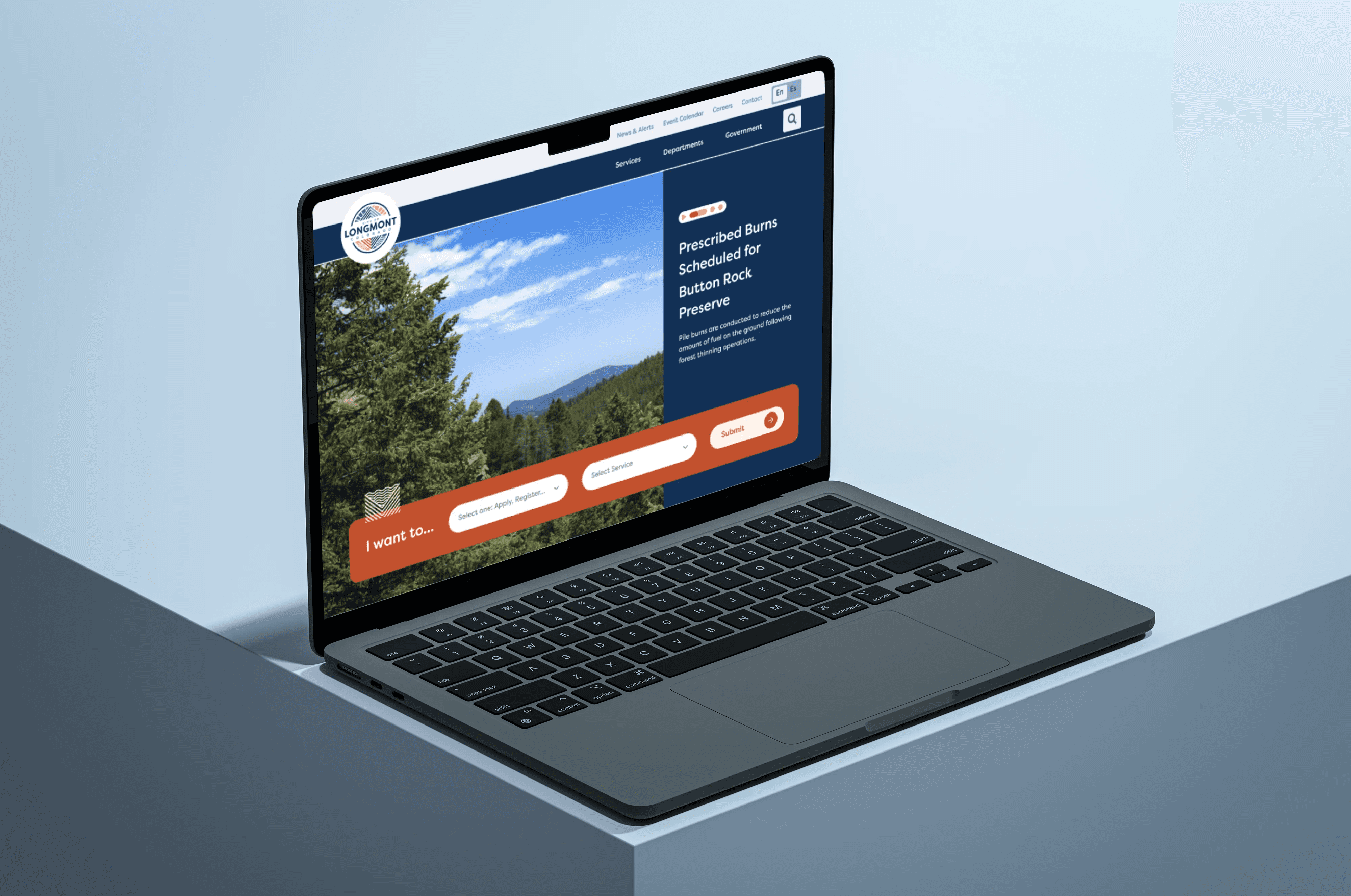
High Fidelity Designs
Flexible Templates and Content Blocks
To ensure maximum flexibility for the City of Longmont’s website, we designed templates that accommodated fixed content types alongside modular content blocks. These blocks allowed the Longmont team to manage content dynamically, customizing the structure of each page to fit their specific needs without compromising the design integrity.
Flexible Templates: These provided a consistent framework for key content types, ensuring uniformity across the site while allowing the team to easily adjust or update content.
Modular Content Blocks: Developed with design goals in mind, these blocks allowed for diverse content presentation, enabling the team to build pages tailored to different user needs, services, or campaigns. The modular structure ensured seamless user experiences across all sections of the site.
This design approach provided Longmont with the flexibility to manage and update content as they wished, while maintaining a cohesive and user-friendly design throughout the website.


Key Learnings
Flexibility in Content Management is Crucial
The use of modular content blocks and flexible templates was essential in providing the Longmont team with the freedom to update and manage content as needed. This approach allowed for adaptability without sacrificing design consistency, making it a key takeaway for future projects.
Balancing Structure and Customization
While flexibility was a primary goal, we learned that maintaining a balance between fixed content types and customizable elements is vital. Fixed elements ensured uniformity, while modular blocks offered customization. This balance was critical in keeping the site both user-friendly and manageable.
User-Centric Design Enhances Usability
Throughout the wireframe testing and content development phases, we discovered that clear labeling and intuitive navigation are central to improving user experience. Addressing terminology and ensuring accessibility were significant learnings that will inform future projects.
Collaboration Between Design and Development is Key
The Figma-based handoff process and regular collaboration between design and development teams were instrumental in ensuring smooth project execution. Continuous communication helped clarify design expectations and allowed for real-time problem solving.
Accessibility Should Be Integrated from the Start
Ensuring the site was ADA-compliant from the wireframing stage through QA taught us the importance of integrating accessibility checks early in the design process. This proactive approach saved time and ensured the site was inclusive for all users.